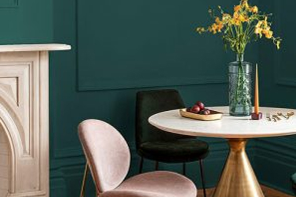
PPG Industries, the parent company of Glidden paints, called Night Watch “a rich, luxurious, and classic shade of green [that] emulates the feeling of lush greenery and the healing power of nature.” A bold, dark color, PPG says Night Watch “has the ability to almost act like a neutral,” though it is also “intense enough” to stand as a feature color on either interior or exterior walls.
PPG’s selection of Night Watch as “Color of the Year” follows its 2018 recognition of Black Flame, another dark, nature-inspired hue designed to promote a restorative, mind-clearing feel.
According to color psychologists – yes, there is such a professional trade that studies the effects of color on human behavior and emotions – shades of green like Night Watch represent growth and renewal, largely spurred by green’s strong ties to nature. Those positive attributes make green a popular choice for virtually any room in the home. Rich, darker hues like Night Watch can deliver composure and calm to a home office or sitting room, while softer greens with hints of blue can produce a soothing effect in a master bathroom.
Here’s how other colors play in the home:
- Pick BLUE if you want … a relaxing, calm, and serene feel. Blue stands a particularly popular choice for bedrooms and bathrooms, spaces where people venture to relax and rest.
- Pick BROWN if you want … a sense of warmth, comfort, and reliability. Brown’s various earthy hues are calm and inviting and, as such, a great choice for living rooms, home libraries, or bedrooms.
- Pick GRAY if you want … sophistication and versatility. Given its neutrality, gray works throughout the home and can be paired with other colors to evoke certain emotions – red, for instance, to stir drama or navy blue to reassure.
- Pick ORANGE if you want … energy and warmth. Orange is often used in areas of the home designed to be more dynamic and exciting, such as an exercise space or sun room.
- Pick PURPLE if you want … to inspire feelings of luxury and creativity. Purple, the traditional color of royalty, is often used to make a statement, which often makes it a great choice in an entry way or formal living room.
- Pick RED if you want … to heighten the senses and manufacture energy. Given red’s intensity, it’s best reserved for common areas designed to be lively and stimulating, such as a kitchen or dining room.
- Pick WHITE if you want … a room to feel fresh, simple, and spacious. The most neutral of all colors, white can be used anywhere in the home where cleanliness and purity is particularly prized, including bathrooms and laundry rooms.
- Pick YELLOW if you want … a space to be cheery and bright. As yellow is said to increase energy, spark creativity, and stimulate the nervous system, it’s a popular choice for kitchens and family rooms.

